
The Hidden UX Trap: Understanding Dark Patterns in Mobile Apps
The Hidden UX Trap: Understanding Dark Patterns in Mobile Apps
Introduction
In today's mobile-first world, user experience (UX) has become a critical differentiator for apps. But there's a darker side of UX too: design choices that steer users into behavior they might not have intended. These are known as dark patterns — subtle manipulations built into app flows that favor the business, not always the user. For developers and UX designers, it is important to recognize these patterns, understand why they work (and why they are risky), and know how to avoid falling into them. This article breaks down what dark patterns are, explores five of the most common ones in mobile apps, and offers practical guidance to build transparent, ethical experiences.
What Are Dark Patterns?
A dark pattern is a user interface or interaction that is intentionally designed to trick or manipulate users into taking actions they might not otherwise take. From obscured fees, nudges that exploit urgency, hidden unsubscribe flows, to permission pop-ups buried inside menus, these small design decisions can frustrate users, erode trust, and even attract regulatory scrutiny.
Common Dark Patterns in Mobile Apps
Below are five of the most prevalent dark patterns seen in mobile apps today. Each section explains how the pattern shows up in real products, why it causes harm, and how better UX choices can avoid these problems.
Drip Pricing / Hidden Fees
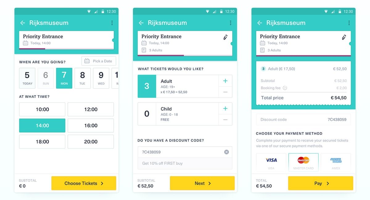
In drip pricing, a user sees a low or attractive headline price or discounted offer, but as they proceed through checkout, additional charges quietly appear as service fees, convenience fees, small-cart fees, or platform fees. Because users have already invested time and effort — picking items, adding them to the cart, and entering details — they are more likely to complete the purchase even when the final amount is higher than expected. This pattern undermines pricing transparency and can feel like a bait-and-switch, especially when the real total is only revealed at the last step. To design ethically, show all major fees upfront before final confirmation, and provide an early summary screen with the total cost including taxes and fees. If extra charges are unavoidable, label them clearly and, where possible, offer users lower-fee alternatives or an option to opt out so they feel in control of the transaction.
Interface Interference / Misdirection
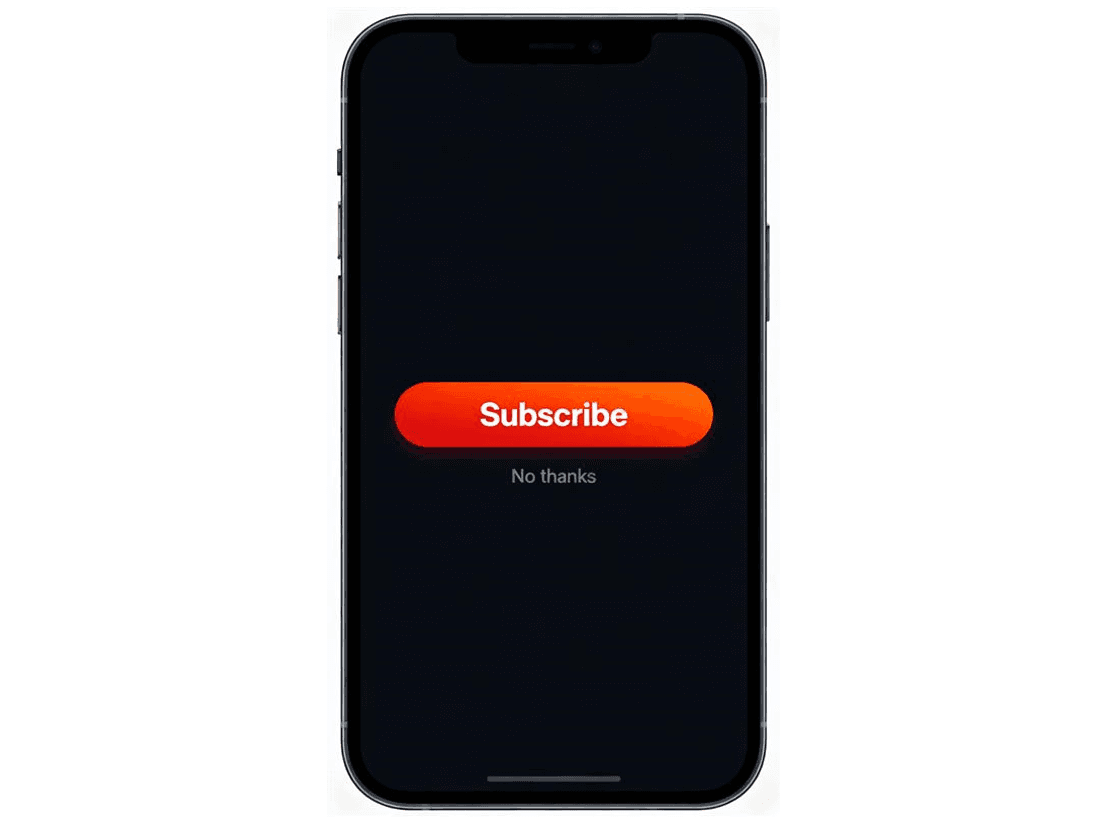
Interface interference happens when the interface makes the user’s safer or more privacy-friendly choice harder to see or access while promoting the business-favorable option. A classic example is a large, bright “Yes, subscribe” button paired with a small, low-contrast “No thanks” link hidden in a corner. Visual hierarchy, colors, size, copy, and placement shape behavior, and users often tap the easiest, most prominent control without fully reading the text. This pattern reduces genuine choice by nudging users toward the option the business prefers rather than presenting balanced alternatives. A more ethical approach is to keep alternative paths equally visible and accessible, use neutral and respectful wording, and avoid over-emphasizing one action when users might reasonably want the other.
Nagging / Repeated Prompts
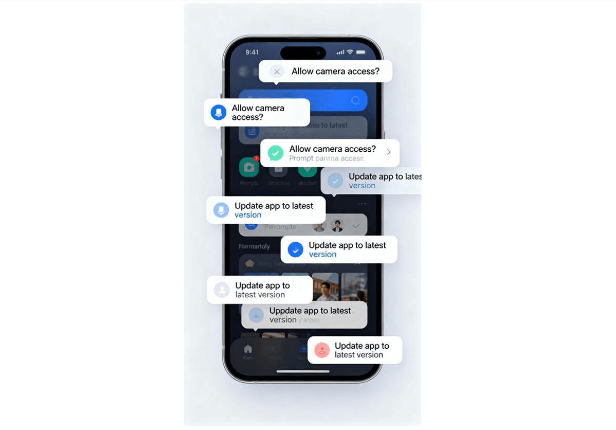
Nagging occurs when users are repeatedly interrupted by pop-ups, modals, permission requests, rating prompts, or upgrade nudges until they eventually yield. The “skip” or “later” option may be hidden, not respected, or repeatedly overridden, so that ignoring the prompt never truly sticks. Over time, the constant interruption leads to fatigue, and users may accept an action or enable a feature just to get rid of the friction. This pattern can significantly harm the experience, making an app feel noisy and pushy rather than helpful. A better pattern is to limit the frequency of such prompts, respect “no” and “don’t show again” choices, and trigger sensitive requests at moments when they clearly benefit the user, not just the business.
Roach Motel / Hard to Exit
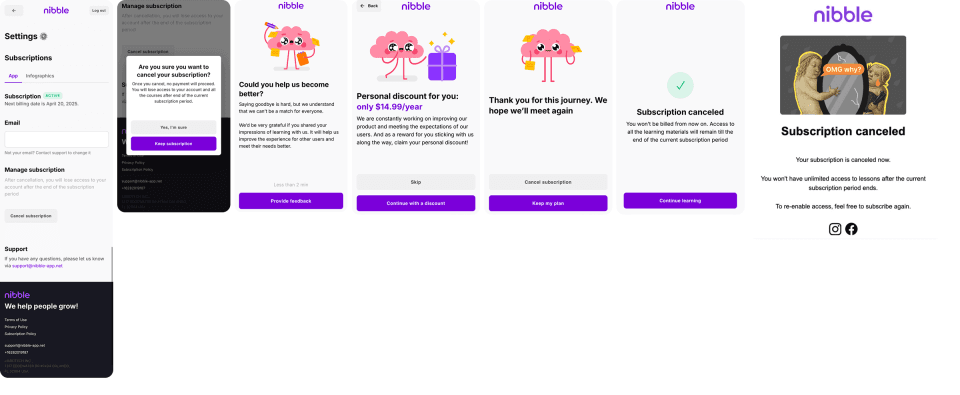
The “roach motel” pattern describes flows where it is very easy to get in but difficult to get out. Signing up, starting a trial, or enabling a subscription may take just a couple of taps, but canceling, deleting an account, or opting out requires navigating deep menus, contacting support, or dealing with multiple confirmation screens. Users may initially join with minimal friction, only to discover later that leaving is slow, confusing, or friction-heavy. This imbalance traps users in situations they did not fully anticipate and often results in resentment, complaints, and negative reviews. To avoid this, design cancellation and opt-out flows with the same simplicity as sign-up, place “Cancel subscription” or “Delete account” options in clearly visible locations, and avoid hiding behind vague links like “Contact us” or support-only exits.
False Urgency / Time Pressure
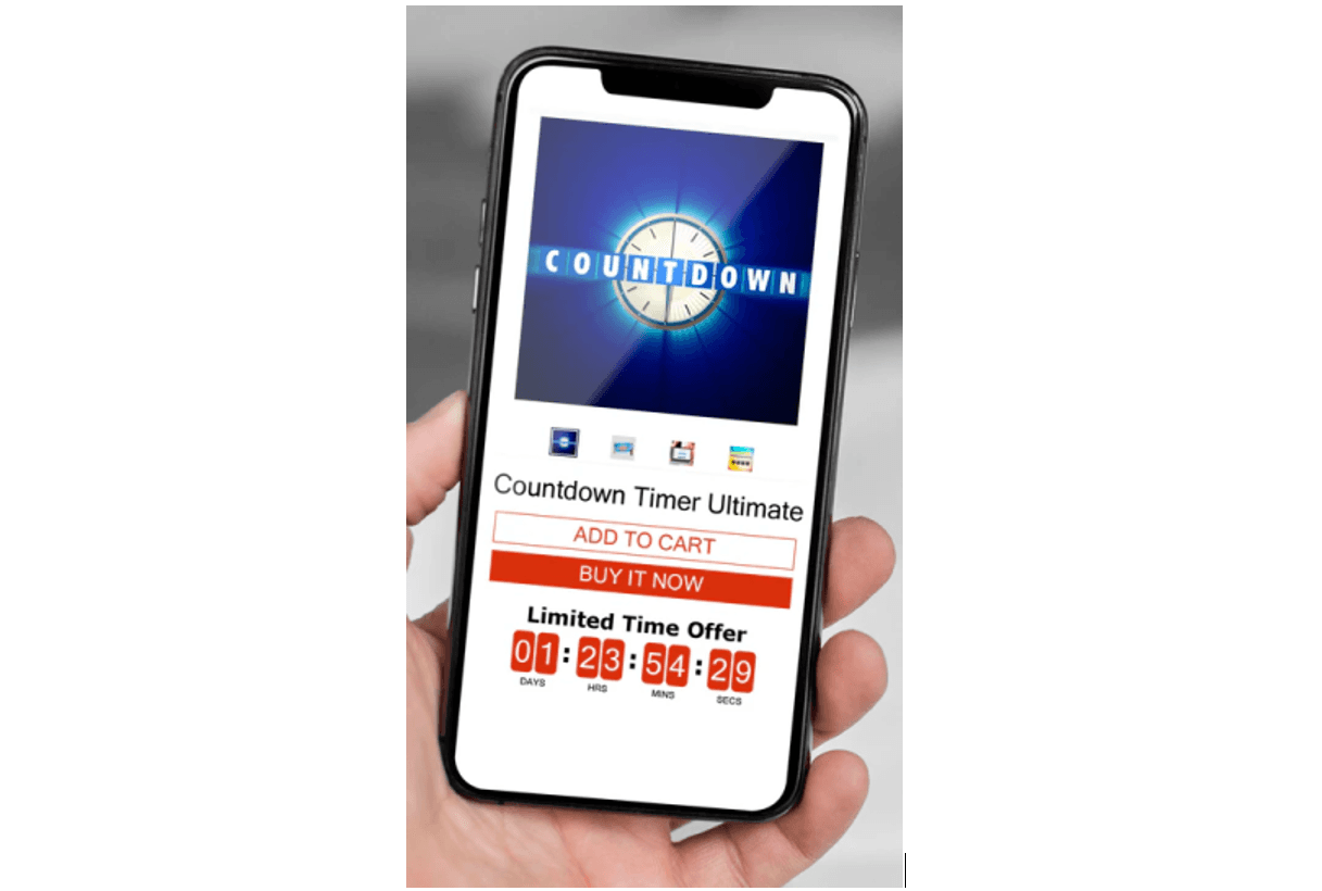
False urgency is when an app creates a sense of pressure or scarcity that is not genuinely tied to real-time constraints or inventory. Messages such as “Offer ends in 5 minutes,” “Only 2 left,” or “Limited stock — hurry!” can activate fear of missing out, pushing users into decisions they would not make with more time. Under perceived time pressure, users may skip comparison shopping or critical evaluation. When the urgency is manufactured or exaggerated, it undermines informed decision-making and sinks user trust once people realize the scarcity is not real. Ethical design uses urgency only when it is factual, backed by real stock or time constraints, and clearly communicated so users still feel free to pause, compare, or come back later.
Why These Patterns Matter
Dark patterns might appear to offer short-term wins by boosting conversions or reducing churn, but they damage long-term trust and retention. Users who feel tricked are more likely to uninstall, leave negative reviews, complain publicly, or avoid recommending the product. There is also growing regulatory and legal risk as authorities in many regions, including India, increasingly focus on deceptive design and unfair trade practices in digital products. Building transparent, respectful interfaces not only improves brand reputation but also reduces exposure to complaints, fines, and compliance issues.
Quick Ethical UX Checklist
Use this brief checklist while reviewing your flows:
-
Are key decisions and consequences clearly explained, in simple language?
-
Are prices, fees, and taxes visible from the start rather than at the final step?
-
Are decline, skip, and opt-out options easy to find and visually comparable?
-
Is cancelling or deleting an account as simple as signing up?
-
Do prompts, banners, and modals appear with a clear user benefit rather than pure pressure?
-
Is any sense of urgency or scarcity grounded in real constraints rather than marketing tricks?
Recent Examples of Dark Patterns
Drip Pricing / Hidden Fees:-
-
FirstCry (India) faced regulatory action from the Central Consumer Protection Authority (CCPA) for misleading price representation where “inclusive of all taxes” messaging was used but additional GST was added at checkout, reducing the true effective discount for users.
-
Zepto has been accused of using dark patterns, such as drip pricing (adding hidden charges like packaging fees at checkout) and basket sneaking (automatically adding a subscription like Zepto Pass to the cart). Following customer backlash and regulatory pressure, Zepto has now overhauled its app to eliminate these deceptive practices, making changes like auto-applying benefits and improving price transparency across all devices.
Interface Interference: In an app purchase flow for vehicle upgrades, Tesla used a visually dominant purchase button together with low-contrast text about non-refundable upgrades, making the risk information less noticeable than the call to action.
Roach Motel / Hard to Exit: Services such as RAC and The New York Times have been criticized by users and UX advocates for making online subscription sign-up easy while requiring phone calls, long holds, or confusing flows for cancellation.
False Urgency / Time Pressure: Indian online pharmacy platforms Tata 1mg and PharmEasy reportedly found instances of misleading urgency messaging during self-audits conducted after CCPA instructions, and CCPA guidelines explicitly list false urgency as a prohibited dark pattern under deceptive design practices.
Final Thoughts
Dark patterns may boost short-term metrics, but they erode user trust, damage brand reputation, and invite regulatory scrutiny. A well-designed app respects user agency, makes key choices transparent, and uses UX patterns to empower users instead of manipulating them.
About the Author

Tarun Jat
Tarun is a skilled frontend developer at Infominez specializing in React and React Native, focused on building clean and intuitive digital experiences.
About the Author
Tarun Jat
Tarun is a skilled frontend developer at Infominez specializing in React and React Native, focused on building clean and intuitive digital experiences.